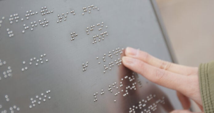

Walk into any well-designed space and you’ll notice how every detail contributes to a cohesive experience—the color palette, the typography, the materials used throughout. Signage is no exception. Yet ADA-compliant braille signage is often treated as an afterthought, bolted onto walls in generic formats that clash with an otherwise thoughtfully curated environment. The good news is that compliance and design no longer have to be at odds. With the right approach, braille signage can become an extension of your brand rather than an interruption to it.
Why Brand Consistency Matters in Signage
Every touchpoint in your space communicates something about your business. Signage guides people through your building, but it also signals professionalism, attention to detail, and care for all visitors. When braille and tactile signs look mismatched or purely utilitorian, they create a visual disconnect that undermines an otherwise polished brand experience. Consistent signage, on the other hand, reinforces trust. It tells visitors that your commitment to quality extends to every corner of your business, including the details many people might overlook.
For businesses in hospitality, retail, healthcare, or corporate environments, this consistency isn’t just aesthetic—it’s strategic. Signage is one of the few brand touchpoints that every visitor interacts with directly, often multiple times during a single visit. Making it feel intentional rather than generic pays dividends in how your brand is perceived.
Understanding the Compliance Constraints
Before diving into customization, it helps to understand what can and cannot flex. The Americans with Disabilities Act sets specific requirements for tactile signage, including character proportions, braille dot spacing, mounting height, and finish contrast between text and background. These aren’t suggestions; they’re the framework within which all design decisions must operate.
The encouraging news is that this framework leaves considerable room for creativity. Compliance dictates the structure, not the style. Think of it the way you might think of a building code: it sets safety parameters, but architects still find endless ways to express creativity within them. The same is true for tactile signage.
Where You Can Customize
Once you know the boundaries, you can start identifying where your brand can shine through.
- Color and finish: While contrast requirements must be met, you have flexibility in choosing color combinations that align with your brand palette. Matte, satin, or metallic finishes can also echo materials used elsewhere in your space.
- Substrate materials: Acrylic, metal, wood-look laminates, and composite materials each bring a different texture and feel. Choosing a substrate that matches your interior design elements—like pairing brushed metal signage with industrial decor—creates visual harmony.
- Typography: While braille and raised characters must meet specific size and font simplicity standards, you often have some latitude in selecting a compliant typeface that still feels aligned with your brand’s visual identity.
- Shape and mounting style: Rounded corners, unique panel shapes, or layered designs can add dimension and personality without compromising function.
- Iconography and logo integration: Incorporating your logo or brand icons alongside required tactile elements helps reinforce recognition throughout your space.
Working with the Right Partner
Customization at this level requires a manufacturer who understands both design and compliance deeply. Not every sign shop has the expertise to balance creative requests with the precision that ADA standards demand. When evaluating potential partners, ask to see previous work that demonstrates both compliance accuracy and design variety. A capable partner will be able to walk you through material samples, color proofs, and mockups before production begins, ensuring there are no surprises once signage is installed.
It’s also worth discussing scalability early in the process. If you’re outfitting a single location now but plan to expand, establishing a signage template that can be replicated consistently across future sites will save time and maintain brand integrity as you grow.
Bringing It All Together
Custom braille signage doesn’t have to feel like a compromise between compliance and design. By understanding where flexibility exists within ADA guidelines, businesses can create tactile signage that feels like a natural extension of their brand rather than a regulatory add-on. The result is a space that feels considered from top to bottom, where accessibility and aesthetics work together rather than against each other.
As you plan or refresh your signage program, treat braille and tactile elements with the same intentionality you bring to every other design decision. Your visitors—sighted and visually impaired alike—will notice the difference, even if they can’t quite articulate why the space feels so well put together.